Quick Answer
Landing pages don't fail from bad design—they fail because business hasn't clarified what visitor should do or why they should trust it. Design attracts. Execution converts.
How This Guide Was Prepared
This guide was prepared by the Naraway editorial team using founder execution patterns, public market references, and practical operating experience from startup support work. It is designed to help readers make better decisions, not to manipulate search rankings.
Last reviewed: May 2026. Publisher: Naraway. Review focus: clarity, usefulness, factual consistency, and founder actionability.
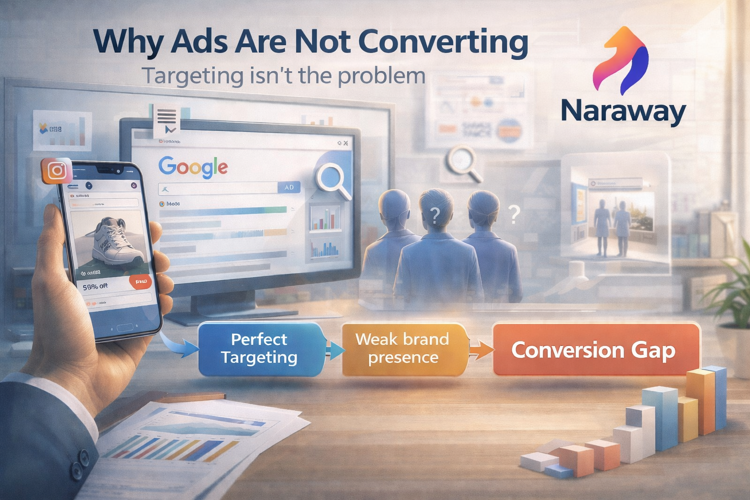
A B2B SaaS startup invested ₹3.5L in landing page design. Clean layout. Professional imagery. On-brand colors. Smooth animations. Team feedback was unanimous: "This looks amazing."
Three months later: 8,000 visitors, 45 signups, 0.56% conversion rate. Traffic came from LinkedIn ads targeting ICP. Bounce rate was reasonable at 52%. Time on page averaged 45 seconds. But almost nobody converted.
Founder's conclusion: "We need better design." The actual problem: page looked professional but reflected internal positioning confusion. Headline spoke to multiple audiences simultaneously. Value proposition was generic "transform your business." Three competing CTAs fought for attention. No clear answer to "who is this for" or "why should I believe you."
A landing page can look great and still fail if it reflects internal confusion instead of user clarity.
Why "Good Design" Creates False Confidence
Visual quality creates illusion that landing page is ready to convert when underlying business clarity hasn't been established.
Founders equate aesthetics with effectiveness. Beautiful page signals completion. If it looks professional, it must work professionally. This conflation is natural—design quality is immediately apparent while conversion effectiveness requires data over time. Teams celebrate design launch without validating whether design expresses clear strategy.
Design is visible, execution isn't. You can show mockups to team and get instant feedback on visual appeal. You cannot show "clarity of value proposition" or "strength of positioning" in mockup. Design decisions are concrete (colors, fonts, layout). Execution decisions are abstract (messaging hierarchy, visitor intent mapping, trust-building sequence). Concrete gets prioritized over abstract.
Early feedback focuses on "looks great." Team members, advisors, friends comment on aesthetics because that's what's visible. "Love the hero section." "Colors are perfect." "Really clean design." Nobody says "your value proposition doesn't differentiate" or "messaging assumes visitor context they don't have" because these gaps aren't visually obvious.
What Conversion Actually Depends On (Beyond Design)
Conversion is business decision visitor makes, not automatic reaction to good design. get your startup registered and legally set up with Naraway
Clarity of problem being solved. Visitor must immediately recognize their problem in your messaging. If headline is "Transform your workflow" but visitor's problem is "invoicing takes too long," they won't connect your solution to their need. Problem clarity means using visitor's language to describe pain they already feel, not abstract benefits they should want.
Strength of value proposition. Why choose your solution over alternatives or doing nothing? Generic claims like "save time" or "increase efficiency" don't create conviction. Specific, defensible value propositions explain exactly how you solve problem better than alternatives: "Process invoices in 2 minutes instead of 20 through automated data extraction."
Relevance to visitor intent. Person arriving from LinkedIn ad about "invoice automation" expects landing page about invoice automation, not generic "business software." Mismatch between what brought them to page and what page offers creates immediate disconnect. Conversion requires matching visitor intent established by traffic source.
Trust and credibility signals. Unknown startups require proof that claims are real. Customer logos, testimonials, specific metrics ("used by 200+ finance teams"), security certifications, case studies—these remove doubt. Without credibility signals, visitors discount promises as marketing exaggeration regardless of how compelling promises sound.
Clear next action. Single obvious step visitor should take. Not "Request Demo" and "Start Free Trial" and "Download Whitepaper" all competing. One primary conversion path with minimal friction. Clarity about what happens after conversion: "Book 15-minute demo, no commitment required" converts better than vague "Get Started."
Design can enhance these elements but cannot create them. Beautiful page with weak value proposition loses to ugly page with compelling value proposition every time.
The Most Common Reasons Startup Landing Pages Don't Convert
These execution failures appear regardless of design quality.
Messaging written for insiders, not users. Using company jargon or product terminology that makes sense internally but means nothing to visitors. "AI-powered workflow optimization platform" tells insiders what you built but tells visitors nothing about what problem you solve for them. Visitor translation: "I don't understand what this does, moving on."
Unclear primary action. Three CTAs above fold: "Start Free Trial," "Request Demo," "Watch Video." Visitor doesn't know which to choose. Multiple options create decision paralysis. Or worse: different CTAs suggest you're unsure what visitor should actually do, undermining confidence in your strategic clarity.
Too many CTAs fighting each other. Every section has different call-to-action. Hero wants trial signup. Benefits section wants demo request. Features section wants whitepaper download. Testimonials section wants case study. Visitor encounters 6+ conversion asks in one page scroll. Paradox of choice kills conversion—people shut down when overwhelmed.
No clear "who this is for." Trying to appeal to everyone—SMBs and enterprises, finance teams and operations teams, technical and non-technical users. Broad positioning makes nobody feel specifically addressed. "For businesses" is too vague. "For 10-50 person finance teams drowning in manual invoice processing" makes specific audience feel seen.
Vague promises without proof. "Save hours every week" without explaining how or showing evidence. "Trusted by thousands" without showing who. Claims without substantiation feel like exaggeration. Visitors need concrete proof: "Reduce invoice processing from 20 minutes to 2 minutes—see how in this 1-minute demo."
These patterns connect to broader issues we documented in our analysis of idea to execution challenges—internal clarity gaps show up externally in customer-facing materials.
Why Early-Stage Startups Struggle More With Landing Page Conversion
Conversion challenges intensify for early startups due to positioning immaturity. Naraway helps you register your startup and get operational fast
Unclear ICP. Still figuring out ideal customer profile means messaging tries serving multiple audiences simultaneously. Can't write compelling copy for specific person when you're unsure who that person is. Generic messaging emerges from unclear targeting, not lazy copywriting.
Evolving product positioning. Product does many things or positioning changes monthly as you learn from customers. Landing page reflects this instability—trying to communicate everything rather than one compelling narrative. Visitors sense uncertainty even if they can't articulate why.
Founders trying to appeal to everyone. Fear of excluding potential customers leads to broad, safe messaging that excites nobody. "Our platform helps all businesses" tries capturing maximum market but creates minimum conviction. Successful landing pages make trade-offs: appeal strongly to specific audience, accept others won't convert.
Lack of confidence in saying no. Won't commit to positioning because "what if we're wrong?" This manifests as hedge language: "whether you're a small business or enterprise" or "regardless of industry." Hedging signals insecurity. Visitors interpret insecurity as inexperience or lack of expertise.
This is positioning debt: unresolved business clarity about who you serve and why. Debt accumulates during product development when focus is building, not positioning. Eventually debt shows up in customer-facing materials creating conversion friction. Redesigning landing page doesn't resolve positioning debt—it just makes debt prettier.
Traffic Without Conversion Is an Execution Signal
Getting traffic but no conversions indicates marketing created awareness but execution failed at decision stage.
Marketing may be working. If traffic is arriving, targeting is probably correct. LinkedIn ads found right people. SEO attracted relevant searches. Content marketing created interest. Top-of-funnel execution is functional—attention acquisition works.
Awareness may be happening. Bounce rate under 60% and time on page over 30 seconds suggests visitors are engaging. They're reading. They're interested enough to scroll. Problem isn't getting attention—it's converting attention.
Execution breaks at decision stage. Visitor reaches conversion moment—should I sign up, request demo, download resource?—and concludes "not convinced enough to act." The gap between "interesting" and "compelling enough to take action" reveals execution failure: value proposition isn't strong enough, trust signals are insufficient, or conversion friction is too high.
Why Design-First Approaches Fail Startups
Starting with design before establishing strategy creates beautiful confusion.
Starting with visuals before messaging. Designer asks "what should hero section look like?" before anyone asks "what should hero section communicate?" Layout gets finalized before value proposition is clear. Result: professionally designed page expressing unclear strategy. Design can't compensate for missing strategic clarity—it can only make unclear strategy look professional.
Copying competitor layouts without context. Successful competitor has specific landing page structure. Startup copies structure assuming it will work similarly. But competitor's page works because their positioning is clear, their brand has trust, their value proposition is differentiated. Copying layout without copying strategic foundation produces superficial similarity without effectiveness.
Skipping conversion logic. Launching page without defining: who is primary audience, what action should they take, why should they take it now, what happens after they convert, how do we measure success. Design-first approach treats these questions as afterthoughts when they're actually prerequisites. Conversion logic should drive design, not vice versa.
Design should express strategy, not replace it. Great design amplifies great strategy. Great design applied to weak strategy just makes weakness more visible.
Naraway Perspective: Landing Pages Are Execution Artifacts
At Naraway, we don't view landing pages as design deliverables. We treat them as execution artifacts that expose underlying business clarity—or lack thereof.
Landing pages reveal three things: Positioning clarity. Can you articulate who you serve and why in single sentence? If not, headline will be vague. Can you explain problem you solve in visitor's language? If not, messaging will use insider jargon. Can you differentiate from alternatives? If not, value proposition will be generic.
Marketing maturity. Do you understand visitor intent and match messaging accordingly? Do you have proof points supporting claims? Do you know which conversion action serves business goals? Marketing maturity shows up in strategic coherence across page elements.
Execution discipline. Is primary CTA consistent throughout? Does copy match what visitor expects from traffic source? Are trust signals credible and relevant? Execution discipline appears in details—consistency, clarity, alignment.
Good conversion comes from getting these foundational elements right: Clear ICP. Specific understanding of who you serve. Not "businesses" but "10-50 person finance teams in service companies drowning in manual invoice processing." Specificity enables compelling messaging.
Aligned messaging. Every element on page reinforces same core narrative. Headline, subhead, benefits, features, testimonials all support single coherent story about problem you solve and why you solve it better than alternatives.
Focused action paths. One primary conversion goal with minimal friction. Secondary actions exist but don't compete with primary. Clear what happens after conversion. Transparent about value exchange—what visitor gets for their email or time.
We see landing page failures as execution misalignment, not design weakness. Fix alignment and conversion improves regardless of design aesthetic. Keep misalignment and redesigning just makes confusion prettier.
Fix Conversion Through Clarity, Not Design
Naraway helps startups align positioning, messaging, and execution so landing pages convert attention into action. We fix the business clarity that design cannot.
Fix Landing Page Conversion Schedule AssessmentWhat Startups Should Fix Before Redesigning Their Landing Page
Strategic fixes that enable conversion regardless of design choices.
Define one primary audience. Stop trying to appeal to everyone. Choose who this page serves. Write that person's job title, company size, specific problem. Every messaging decision gets evaluated against "does this resonate with our primary audience?" Specificity creates relevance which drives conversion.
Clarify one core action. What should visitor do? Sign up for trial, request demo, download resource, schedule call—pick one. Design entire page around making that one action easy and compelling. Remove competing CTAs. Create single conversion funnel with minimal friction.
Align messaging with intent. What brought visitor to page? LinkedIn ad about invoice automation? Google search for "automated invoicing"? Content piece about finance operations? Page should match that context immediately. Headline should reflect what they searched for or clicked on. Disconnect between expectation and reality kills conversion instantly.
Remove internal assumptions. Read page as visitor with zero company context. Does messaging make sense? Or does it assume knowledge only insiders have? Use visitor language, not product language. Explain value in terms of outcomes visitor cares about, not features you built.
These fixes don't require design changes. They require business clarity about who you serve, what problem you solve, and why someone should choose you. Once clarity exists, any competent designer can express it effectively. Without clarity, even exceptional design produces low conversion.
Final Reframe: A Landing Page Doesn't Convert Because It Looks Good. It Converts Because It Removes Doubt.
Conversion isn't aesthetic response. It's confidence threshold.
Visitor arrives with question: "Can this solve my problem better than alternatives or doing nothing?" Page that answers question clearly, credibly, and compellingly gets conversion. Page that leaves question unanswered gets bounce regardless of visual quality.
Design matters—professional aesthetics build credibility, poor design erodes trust. But design is multiplier not foundation. Beautiful design on weak positioning produces beautiful low conversion. Adequate design on strong positioning produces adequate high conversion. Ideal is both—strong positioning expressed through professional design.
If your landing page looks great but doesn't convert, resist instinct to redesign. Instead, audit positioning clarity, messaging alignment, value proposition strength, and conversion friction. These business fundamentals determine conversion effectiveness. Design amplifies whatever foundation exists.
Fix the foundation. Then design enhances it. Start with design and you're optimizing the wrong variable.
Convert Attention Into Action
Naraway helps startups build landing page conversion through positioning clarity and messaging alignment. We fix the execution gaps that beautiful design cannot solve.
Build Conversion InfrastructureGlobal Presence in 700+ Cities Across 195 Countries
Serving Businesses Worldwide with Local Expertise
Naraway provides professional IT development, e-commerce solutions, web development, AI integration, digital marketing, and business services to startups, SMEs, and enterprises across every major city in India and 195+ countries worldwide.
Indian Metro & Tier-1 Cities
Major Business Hubs - Mumbai, Delhi, Bangalore, Pune, Hyderabad & More
International
Complete Global Coverage - All 195 Countries
We serve businesses in every country worldwide